ENTRY 03·B.02, PROCESS GUIDE
SOCIAL MEDIA MANAGEMENT · INNER PAGEPROCESS 02 OF 04
Instagram Feed Design & Layout Development
A real feed-design project for Galit Fuller that moves from trend research and competitor references into a mood board, style guide, and nine-post Instagram layout.
02/ 04 PROCESS GUIDES
PROCESS MAPFeed system
What this process solves.
Create a visual system that communicates coaching credibility while keeping Galit’s brand warm, personal, confident, and approachable for people who experience networking anxiety.
Where it leads.
A cohesive pink, purple, and deep-blue system that alternates human, on-the-go posts with bold editorial graphics—giving visitors both credibility and relatability.
03 · REAL DESIGN CASE
From research to a cohesive feed.
This case condenses Mohamad's complete trend research, visual direction, style guide, and nine-post feed development.
Bold editorial aesthetic
Large display typography, saturated color, portrait photography, and layouts that feel closer to a magazine or poster wall.
Creates instant attention and gives a personal brand a confident point of view.Neon glow typography
Dark, high-contrast backgrounds paired with one recognizable neon accent and bold poster-style type.
Shows how a consistent accent color can make a feed recognizable during a fast scroll.STYLE GUIDE · COLORDeep blue#1D1B6C Purple#5B2C90 Hot pink#E91E89 Soft lavender#EDE7F6
STYLE GUIDE · TYPEPlayfair Display · headingsMontserrat · body copy
Warm, supportive, and confident. Lead with empathy and inspire action.
Help entrepreneurs build authentic connections that lead to real growth.
Empowering, conversational, and clear—speaking to one person, not at them.
FEED APPROACH
Personal content, held together by a clear visual rhythm.
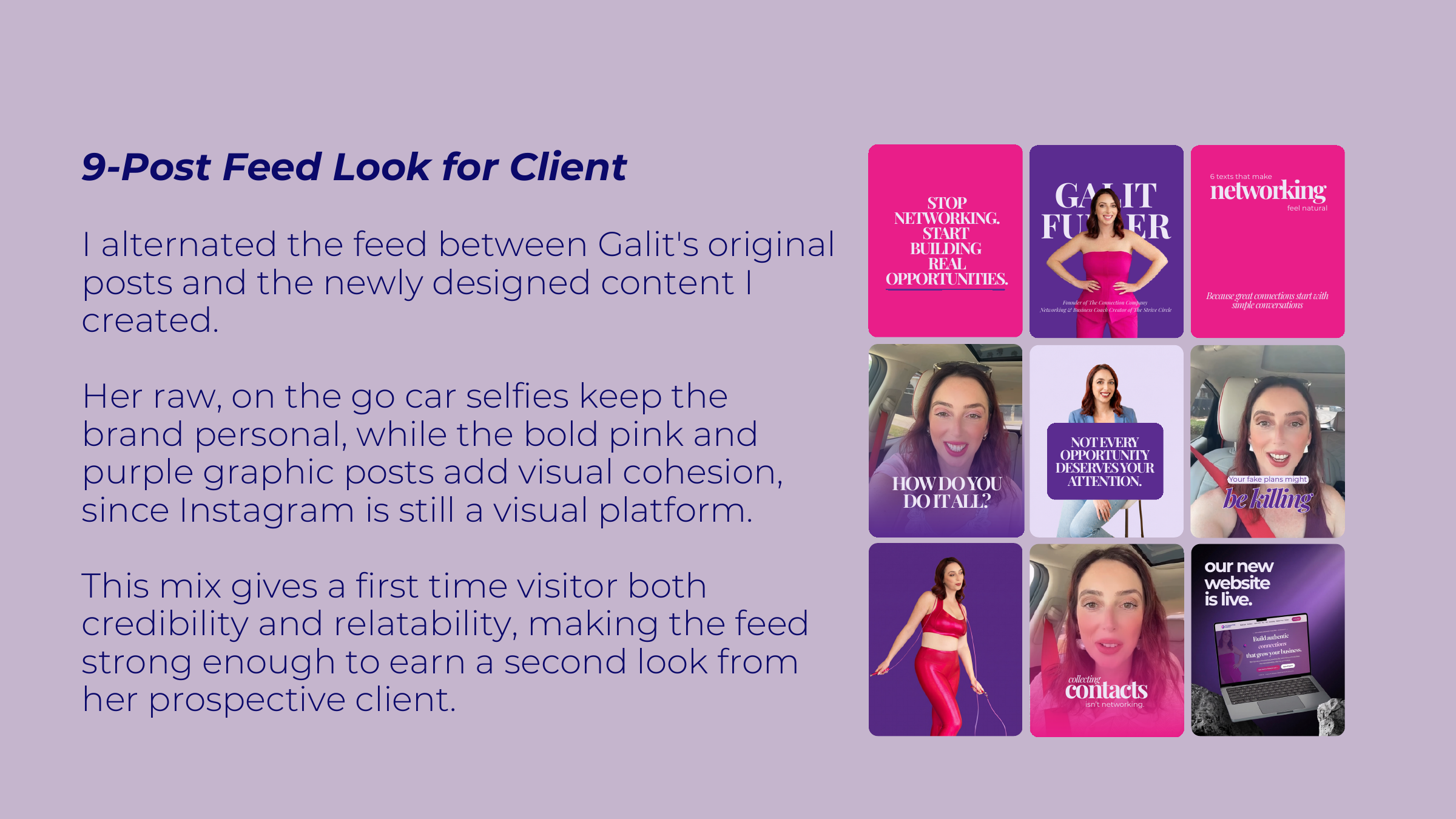
- 01Alternate Galit’s original posts with newly designed content.
- 02Keep raw, on-the-go car selfies to preserve the personal side of the brand.
- 03Use bold pink and purple graphics to create cohesion and a stronger visual rhythm.